
The Map: See Quality and Price at the Same Time
Screeners answer one question at a time, so you read the quality list, then the valuation list, and try to find the overlap from memory. The Map puts both on one chart and turns that overlap into a place you can point at.
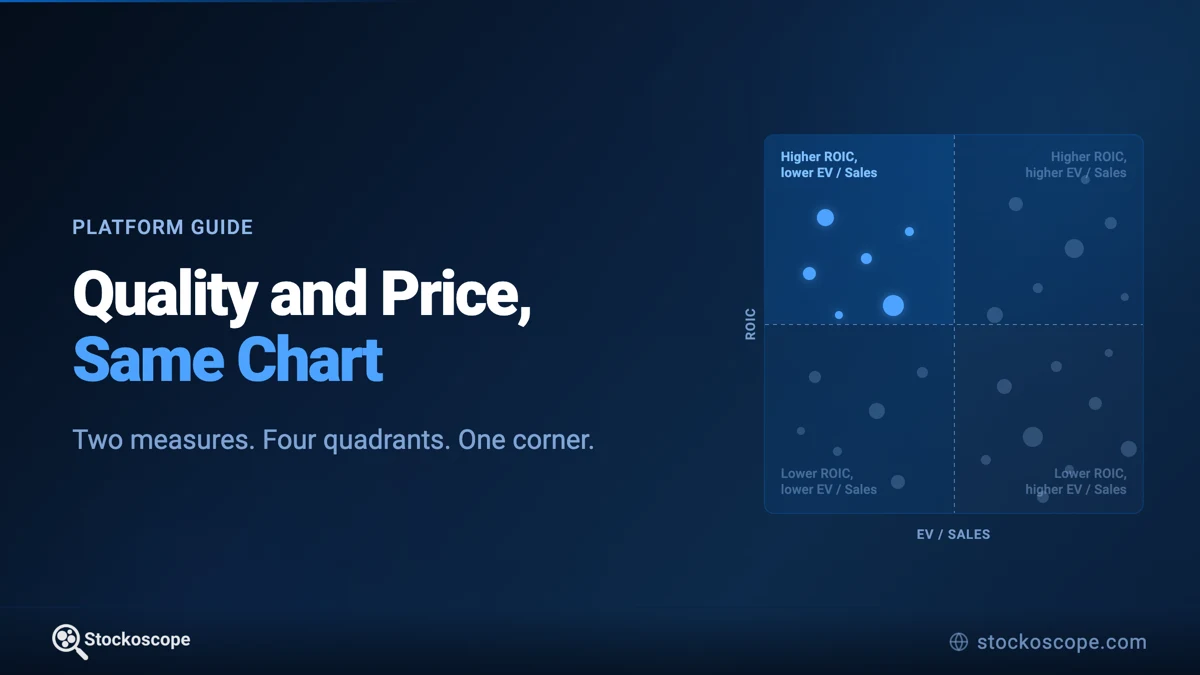
A good company and a good price are two different questions, and almost every tool answers them one at a time.
Sort a screener by return on invested capital and you learn which businesses earn well, with nothing to say about what you would pay for them. Sort by EV / Sales and you learn what is priced modestly, with nothing to say about whether it has earned the discount. So you read one list, hold it in your head, read the other, and try to find the overlap by memory. The companies that matter most are the ones on both lists, and that is exactly the thing neither list shows you.
The Map puts both questions in one frame. Quality runs up the side, price runs across the bottom, and a line through each splits the market into four corners. Now the overlap is not something you reconstruct, it is a place on the chart: the corner where a high return on capital meets a modest multiple. One glance tells you who is sitting there, who is nowhere near it, and how crowded that corner is to begin with.
Quality against price is only the most common pairing. Growth against what you pay for it, returns against leverage, yield against the payout ratio that has to sustain it - any two measures you can name a trade-off between will do the same job.
It is the fourth tab on the screener, alongside Simple, Advanced and Presets, and it is included with Pro.
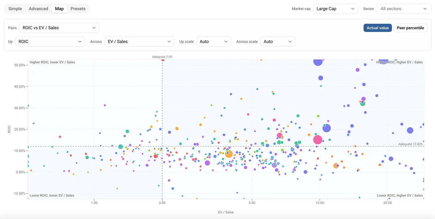
Figure 1: The default view. Every US large cap on return on invested capital against EV / Sales, split at the two lines we publish - 12.00% for ROIC and 2.00 for EV / Sales. Colour is the sector, size is market cap, and the top-left corner is the one most people are looking for.
How it works
You do not have to build anything. Open the Map and it is already plotting ROIC against EV / Sales, and the Pairs control at the top holds nine ready-made combinations to move between:
- ROIC vs EV / Sales
- ROIC vs P/E
- ROE vs P/B
- ROE vs Debt to Equity
- Net Margin vs EV / Sales
- Gross Margin vs Revenue Growth
- Revenue Growth vs EV / Sales
- Free Cash Flow Yield vs EV / EBITDA
- Dividend Yield vs Payout Ratio
Each one pairs something a business earns against something the market charges for it, or against the risk carried alongside it. Picking a Pair is a single click, and for most questions that is the whole interaction.
When you do want to build your own, the two pickers below are labelled Up and Across rather than y-axis and x-axis, because "y-axis" tells you nothing about what you are about to see. There are 37 measures on each, grouped by category, and the only pair you cannot make is a measure against itself. The Pairs control keeps showing which combination you are on and falls back to a placeholder once you build something of your own.
The axis pair, the scales and the mode all live in the URL, so a view you built is a link you can send.
Every company in scope becomes a dot:
- Position is the two measures you chose. This is the whole claim the chart makes.
- Size is market cap.
- Colour is the sector.
- The logo appears once the view is narrow enough to read one. Scope to a single sector and every company carries its logo, which also means Peer percentile mode always shows them. Across the whole market they appear below about 90 companies and give way to plain dots above that, where they would be an unreadable mass. Phones stay on plain dots throughout, because a logo small enough to fit on a phone plot is too small to recognise.
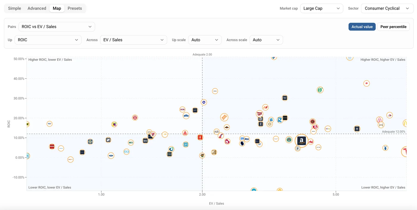
Figure 2: Consumer Cyclical on its own. Narrowing to one sector brings in the logos and thins the plot out enough to read individual companies rather than a cloud. Amazon is the largest dot, sitting just below the ROIC line.
Hover any dot for the exact numbers behind it. On a phone, the first tap pins a company and shows its readout, and a second tap opens its stock page, so a stray tap never navigates away from a chart you were still reading.
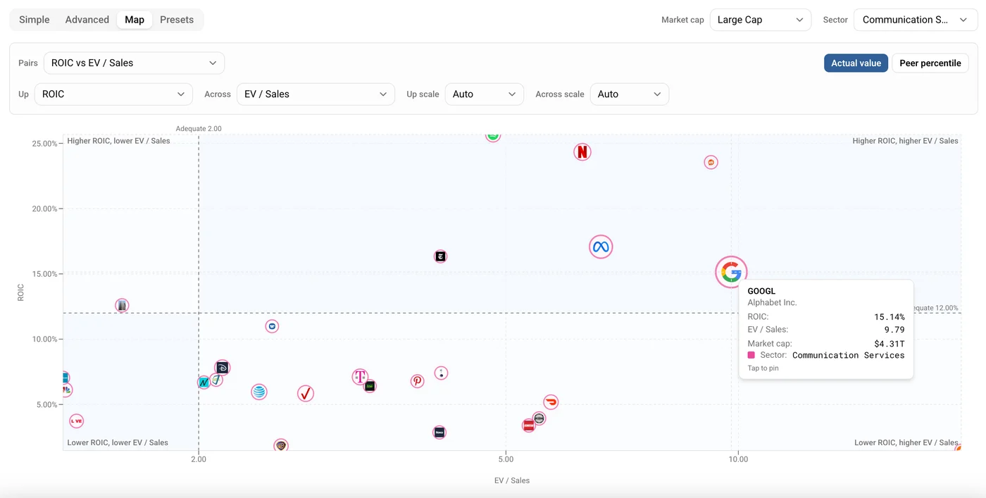
Figure 3: The readout on hover. Alphabet in Communication Services - 15.14% return on invested capital at 9.79 times sales, with the $4.31T market cap that sets the dot's size and the sector swatch that sets its colour.
The four quadrants are drawn at published lines, not at the median
This is the part that makes the Map different from a generic scatter plot.
The two dashed lines are not the average of what happens to be on screen. They sit at a benchmark we publish for each measure: the point at which it reaches Adequate on the same 1-to-5 scale that scores every metric elsewhere on the site. The label on each line names it, so a ROIC axis is split at "Adequate 12.00%" and you can see the number rather than infer it.
Because the line is fixed, the quadrant a company falls into does not change when you change the scope. Filter to a different market cap and companies move in and out of the view, but the lines stay where they are.
Each corner is labelled with what it means, generated from the two axis labels: "Higher ROIC, lower EV / Sales" in one corner, "Lower ROIC, higher EV / Sales" in the opposite one. Hover a corner label and it lists the companies sitting in it.
You will notice what those labels do not say. They describe magnitude and direction, never a verdict. A corner will tell you that the companies in it have a higher return on capital and a lower sales multiple. It will not tell you they are cheap, or strong, or worth buying. That is a deliberate line, and it holds everywhere in the Map.
Two ways to read the same pair
The toggle at the top right switches between two genuinely different questions.
Actual value plots the real numbers. A 30% return on invested capital is drawn at 30%, and positions compare across the whole market. This is the mode for absolute questions: who clears the line, and by how much.
Valuation multiples get a log scale by default here, because a linear axis puts nine tenths of the market in the leftmost tenth of the plot and turns one expensive outlier into the entire chart. You can override the scale per axis if you want to see it the other way.
Peer percentile replaces both numbers with a rank from 0 to 100 against the company's own sector. This is the mode for relative questions, and it is the one that lets you compare businesses that have no business being compared on raw numbers - a utility and a software company have different natural ranges for almost every measure, and ranking inside the sector removes that.
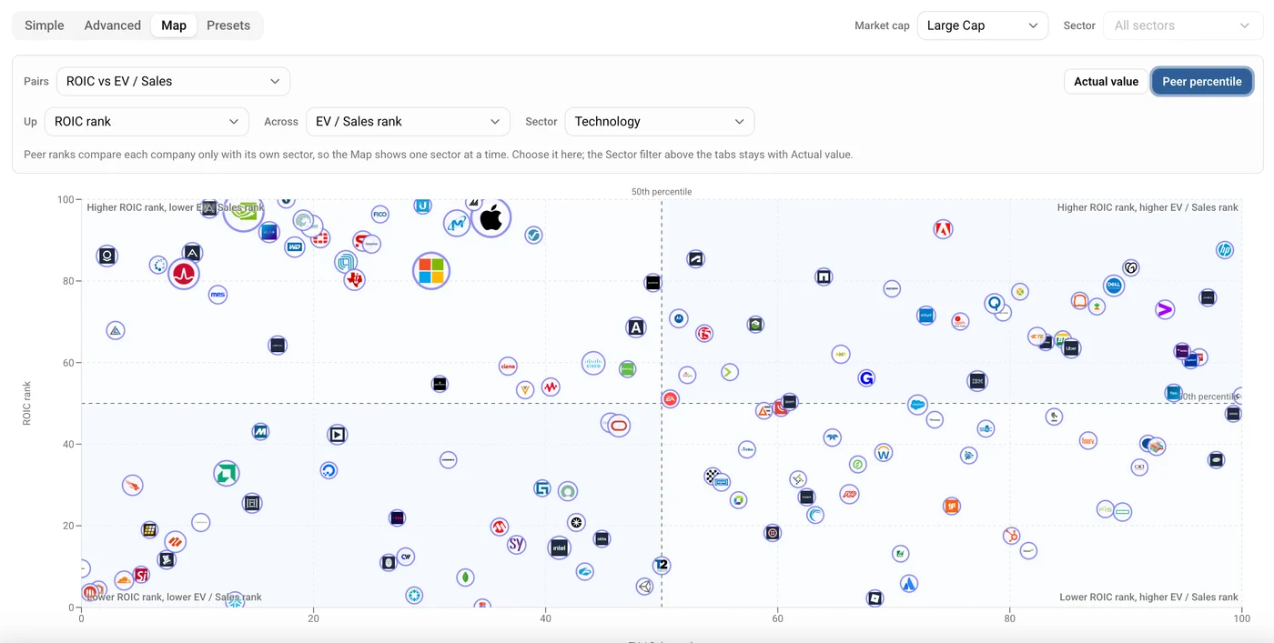
Figure 4: The same pair in Peer percentile. Technology ranked against itself on both axes, so the dividers move to the 50th percentile and a position becomes a standing among peers rather than an absolute number. Note the sector picker beside the axes, and the greyed-out Sector filter above the tabs.
Two things about ranks are worth knowing before you read one.
The first is that a rank only means something inside one sector, so Peer mode plots one sector at a time. It has its own sector picker, and the screener's shared sector filter greys out while you are in it, so the two can never disagree about what you are looking at.
The second is that ranks always run the same way round, including for measures where a lower number is better. A high Debt to Equity rank means less debt, not more. To make that concrete, in the Technology sector at the time of writing, Arista Networks ranks 99th percentile on Debt to Equity with a ratio of 0.00, while Oracle ranks 7th percentile with a ratio of 3.67. Both readings are in the tooltip together, the rank and the number behind it, so you never have to remember which way a particular measure points.
The honest bits
A chart that can draw hundreds of companies at once has to make decisions, and the ones the Map makes are visible rather than hidden.
Outliers do not get to set the axis. The plotted range is trimmed at the tails, so a single company with a 400x sales multiple does not compress everything else into a smear. But trimming the axis is not the same as dropping the company: anything beyond the range is drawn at the edge and flagged in its tooltip as beyond the plotted range, with its true values still readable. Nothing is silently deleted, because a chart that quietly removes its most extreme companies is lying about the market.
When there are too many companies to draw, it says so. Above the render cap the chart shows the largest companies, spread across all four quadrants so no corner is starved, and prints a line telling you how many of how many you are seeing.
When an axis cannot plot something, it says why. If a measure is missing for part of the view, or a log scale cannot place values at or below zero, the notice above the chart names the count and the reason rather than quietly showing you a thinner market than you asked for.
Positions are exact. Our original bubble screener runs a physics simulation that nudges bubbles apart so they stay readable, which is harmless when the horizontal axis is only spreading things out. On the Map, both axes carry meaning, so a nudged bubble would cross a line and the chart would then assert something false about a named company. There is no simulation here at all. Every dot sits where its numbers put it, and if two dots overlap, that is because the two companies really are in the same place.
What it is for
The Map is a thinking tool rather than an answer machine. Six things it does that a sorted list cannot:
Working one corner deliberately. This is the main event. Pick a quality measure for Up and a valuation measure for Across, and the corner you care about is fixed in place before you look: high on the first, low on the second. Everything in it has cleared both published lines at once. That is a shortlist you did not have to assemble, and unlike a filtered table it arrives with its own context, because you can see how far into the corner each company sits and what it gave up to get there.
Reading the price of quality. The shape of the cloud tells you what the market is currently charging for the thing you are screening on. A tight upward band means quality is priced efficiently and the corner will be thin. A loose scatter means the relationship is weak right now and the corner may be worth a proper look. Same two axes, different sector, completely different picture.
Seeing who is unusual. A company sitting well away from the crowd is interesting whichever direction it sits in. A table shows you the top of one column at a time, so a company that is unremarkable on both columns separately but unusual in combination never surfaces. On the Map it is the dot on its own.
Understanding why a corner is empty. Sometimes the answer is that nothing qualifies, and that is a finding rather than a failure. An empty top-left corner in a sector says the market is not currently offering that trade, which is worth knowing before you spend an afternoon looking for it.
Sanity-checking a screen. Run a preset, then plot the same two measures and see where the survivors actually sit. Sometimes a filter that felt demanding turns out to have cut along a line the market had already priced, and everything that passed is bunched against the threshold rather than comfortably clear of it.
Comparing unlike businesses. Switch to Peer percentile and a regional bank and a semiconductor company can sit on the same chart without one of them being nonsense. The corner then means "high on both, for its own sector", which is a different and often more useful question than the absolute one.
Where to find it
Open the screener, choose the Map tab, and pick a pair. The "How to read this Map" panel underneath the chart covers the dot encoding, the quadrants and the two modes in about thirty seconds.
The screener's scope controls sit above the tabs and apply to the Map like they do everywhere else, so you can narrow to a market cap band or a set of sectors first and then plot.
As with everything on Stockoscope, the companies the Map surfaces are candidates for your own research. The chart shows you where things sit. What that means is your call.