
The Valuation Football Field: Different Ways to Value a Stock on One Chart
Valuing a stock two different ways, with a cash flow model and with market multiples, leaves you holding a dozen or more separate estimates. Here is how we turn multiples into plain dollar values and put every estimate on one chart, so you can see where they agree, where they disagree, and how far today's price sits from each.
Price is what you pay, value is what you get
A stock has a price, and that price is easy to find. What is much harder, and much more useful, is an estimate of what the business behind it is actually worth. That estimate is what valuation is for. Put the two side by side and you can ask the only question that matters at the point of buying: is today's price a fair reflection of the value, or is it running well ahead of it or behind it?
This matters because price and value drift apart all the time, and the gap does most of the work in an eventual return. A good business bought when the price sits well below a reasonable estimate of its worth comes with a margin of safety. The same business, when the price has run far ahead of that estimate, can leave an investor right about the company and still disappointed. Valuation is how you tell those two situations apart. It is never a precise number, only an informed estimate, so the goal is a sensible range, not false certainty.
Two ways to estimate what a business is worth
There are two broad ways to arrive at that estimate, and they come at the problem from opposite directions.
The first builds a value from the ground up. A discounted cash flow model, or DCF, projects the cash a business will generate over the coming years and discounts those future dollars back to what they are worth today, since a dollar a decade from now is worth less than a dollar in hand. Add the discounted cash flows together, divide by the number of shares, and you get an intrinsic value per share: the model's own answer to what the business is worth, independent of what the market happens to be paying for it right now. The number is only as good as its assumptions, which is why we treat it as one input rather than the final word. We have written up how our engine builds it, with the assumptions all on show, in a separate guide to the DCF, and you can watch one run end to end on a real company in our Meta valuation case study.
The second way is comparison. Instead of building a value from scratch, you look at how the market prices similar businesses, using ratios called multiples. Price-to-earnings, or P/E, is the familiar one: a P/E of 20 means investors are paying $20 for every $1 of the company's annual profit. There are several others that measure value against a different yardstick, such as sales, cash flow, or earnings before interest and tax. Each multiple captures a slightly different angle on how richly or cheaply a company is priced.
Turning multiples into implied values
Multiples have a catch, though. A raw ratio is hard to interpret on its own, and impossible to line up next to a DCF's dollar-per-share estimate. Is a P/E of 15 cheap? It depends entirely on what you compare it against. And "15 times earnings" and "an intrinsic value of $100 a share" are not in the same units, so you cannot put them on the same footing.
So rather than leave a multiple as a bare ratio, we convert it into an implied value: a plain dollar price. The question it answers is simple. If this stock traded at some benchmark multiple, what would its share price be?
An example makes it concrete. Suppose a company earns $5 per share in annual profit. If businesses like it typically trade at 20 times earnings, that points to a price of $100 a share (20 times $5). If the stock actually trades at $80, then on this measure the price sits about 25% below the value that pricing implies. Now run the same sum against a different benchmark, the multiple the company itself has averaged over the past ten years, say 16 times earnings. That points to $80, right about where it trades. Same company, same profit, two benchmarks, two different reads. That contrast is the whole point.
Those two benchmarks are exactly the ones we use for every multiple, because "expensive" or "cheap" only means something relative to a reference point:
- Sector peers. What the price would be if the stock traded at the median multiple of comparable companies. This answers "how is it priced against businesses like it?"
- Its own 10-year history. What the price would be at the multiple the company itself has typically traded at over the past decade. This answers "how is it priced against its own past?"
Crucially, an implied value is a dollar figure, so it sits directly alongside the DCF's intrinsic value. Everything is now in the same currency, literally. For a fuller tour of the individual multiples we use and how each one reads, see our Valuation Analysis guide.
The problem: too many numbers to hold in your head
Here is where it gets unwieldy. We run nine multiples, each against both benchmarks, which is eighteen implied values. Add the DCF's intrinsic value, and a blended headline on top, and a single stock produces around twenty separate estimates of what it might be worth.
Shown the way most tools show them, spread across separate cards, tables and charts, each on its own scale, twenty estimates are almost impossible to compare at a glance. Do the methods agree? Where do they part ways? And how far does today's price sit from each? Those questions live in the gaps between the numbers, and you cannot answer them by scrolling between cards and holding figures in your head.
One chart: the valuation football field
So we put every estimate on a single chart. It is called a valuation football field, a name borrowed from the charts analysts use to stack valuation ranges side by side, each method laid out like a marked line across a playing field.
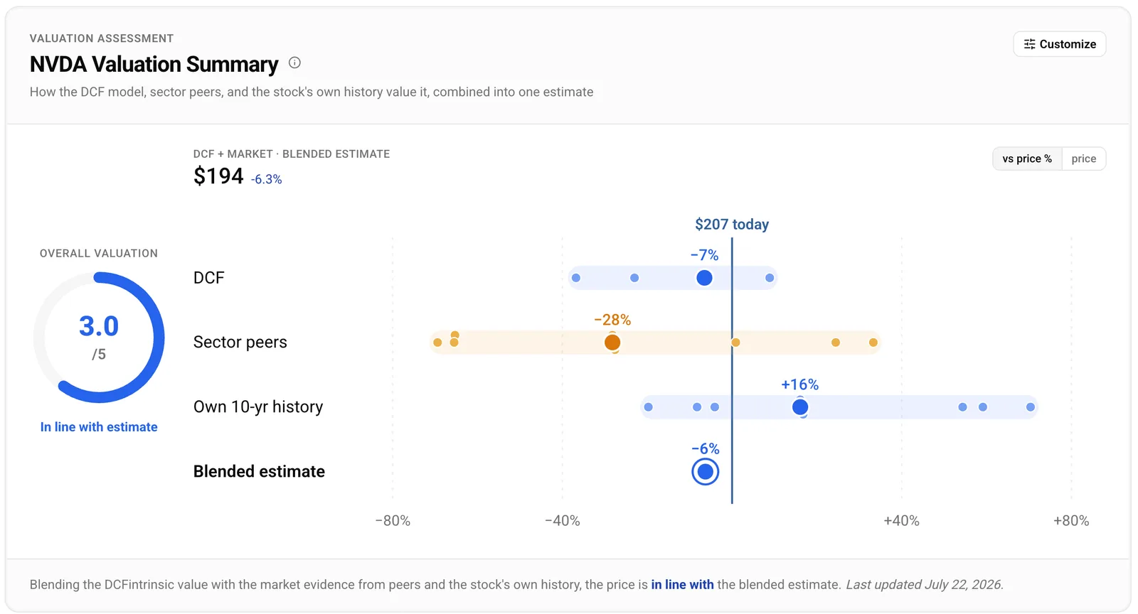
Figure 1. NVIDIA's valuation football field, in dollars. Every method sits on one shared axis, measured against the $207 price: the DCF and the blend land just below it at $194, sector peers well to the left at $149, and the stock's own 10-year history to the right at $241. Snapshot 22 July 2026.
It has one horizontal axis, and it measures one thing: how far each estimate sits from today's price. The bold vertical line marks today's price. Everything to the left of it is an estimate that sits below the price; everything to the right sits above it. The rows, top to bottom, are the methods we have just walked through:
- The intrinsic model, which for NVIDIA is the DCF.
- The implied values from sector peers.
- The implied values from the stock's own 10-year history.
- The blended estimate that reconciles them.
The marks are consistent across every row. A small dot is one individual implied value, from one multiple. A large dot is that method's representative value, the composite of its multiples or the base case of the model. A ring is the blended estimate. A soft shaded band shows the range a method spans. And a toggle in the top-right corner flips the axis between plain dollars and percentages, the same picture in whichever unit you prefer to think in.
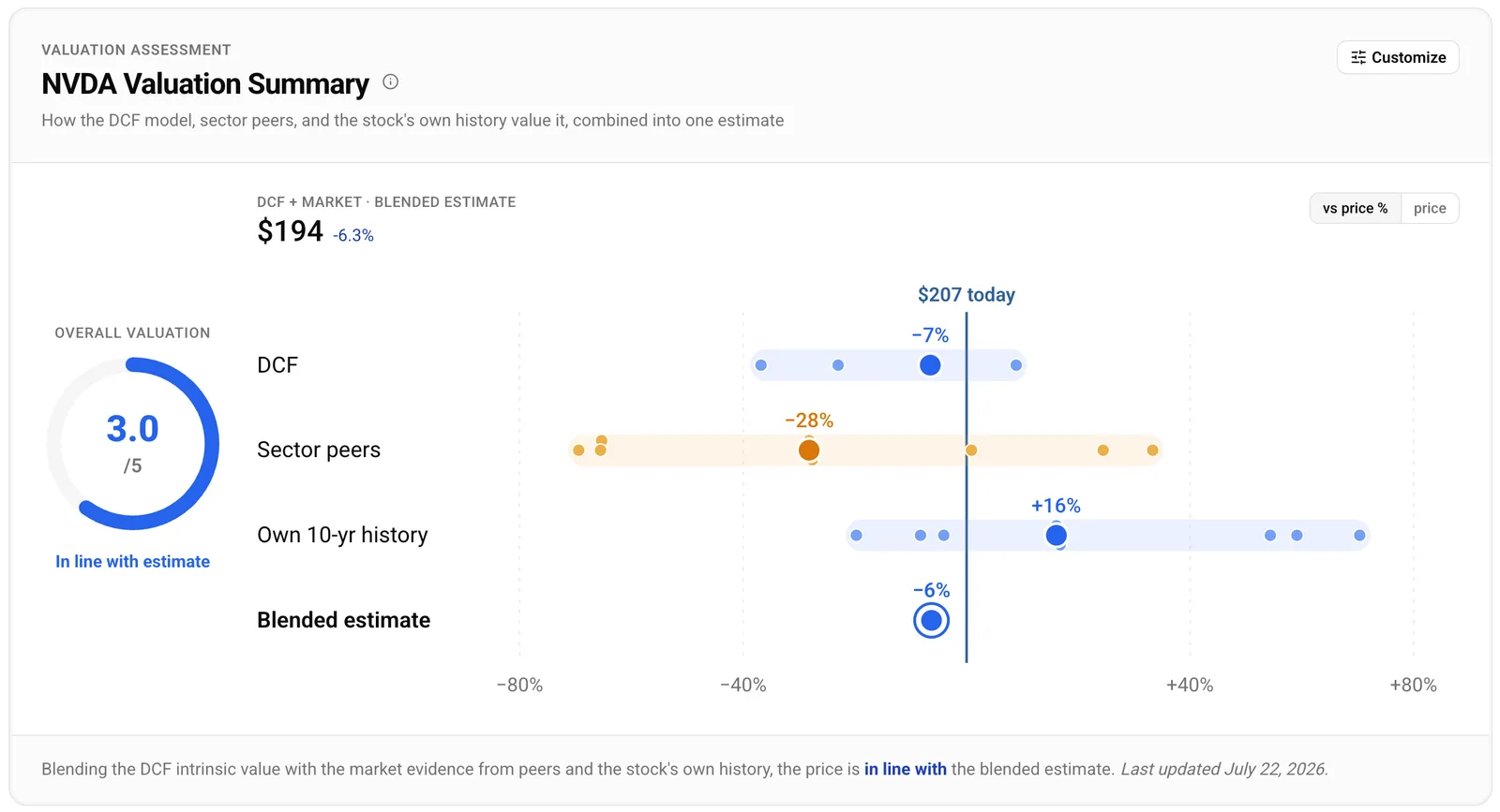
Figure 2. The same chart with the axis relabelled as percentages. Identical geometry, different unit: now each estimate reads directly as its distance from the price, with peers at -28%, the stock's own history at +16%, and the DCF and blend within a few points of today's $207.
NVIDIA at a glance
With the pieces in place, NVIDIA's chart reads quickly. These figures are a snapshot from 22 July 2026, when NVDA traded at $207.29. Prices move, so treat them as of that date.
The DCF model lands close to the price, with a base-case estimate of $194, so its large dot sits just left of the line. On a cash flow basis, the model reads the price as roughly in line with its own estimate. Sector peers sit well to the left: the composite of NVIDIA's peer-implied values is $149, about 28% below the price, so on the multiples its semiconductor peers trade at, the stock looks expensive. That is the peer lens talking. Its own 10-year history sits on the other side, to the right, with a composite of $241, about 16% above the price, so against the multiples NVIDIA itself has traded at over the past decade, the price sits lower than its own norms. The blended estimate, the ring, also lands at $194, about 6% below the price, labelled "in line with estimate" and scored 3 out of 5.
Our own read on NVIDIA's valuation is a separate piece, NVIDIA, priced for a slowdown. The chart's job here is narrower and comes first: show the spread honestly, so you can see which question to ask.
The details that keep it honest
Hover, tap or focus any dot and a plain-English tooltip explains it: what the multiple measures, what this stock trades at on it, the benchmark behind it, the dollar it implies, and the multiple's honest caveat. The model row's dots are different, and the tooltip says so: they are the one DCF estimate re-run across a range of growth assumptions, a sensitivity check rather than separate evidence, so a modelled assumption is never dressed up as a company fact.
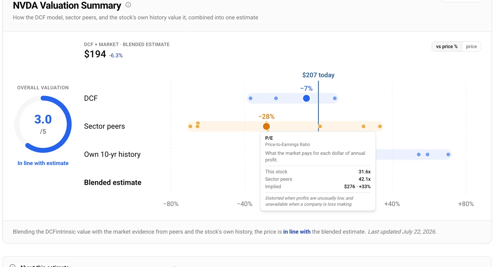
Figure 3. Every dot explains itself. Hovering NVIDIA's price-to-earnings dot shows what the multiple measures, the stock's 31.6x against the peer median of 42.1x, the $276 that implies, and the multiple's caveat.
Some readings are too extreme to sit on the axis. Rather than pin them to the edge, where several very different values would line up and falsely look like agreement, the chart stops the axis just past the ordinary readings and draws the rest as small arrows, or carets, with their true value in the tooltip. Cognizant (CTSH) is the clear case: trading near $44 on the same snapshot, every one of its nine sector-peer implied values landed roughly 3.7 to 7 times higher, so its whole peer row runs off the end while the other rows stay on scale. We told the fuller Cognizant story in a separate case study.
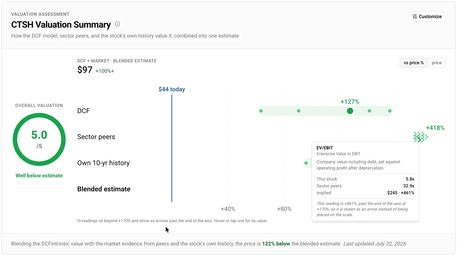
Figure 4. Cognizant (CTSH), 22 July 2026. Its sector-peer readings land so far above the depressed price that they run off the end of the axis and show as arrows, rather than being pinned to the edge. The tooltip carries the true value: this one is +418%, well past the axis end at +170%.
Why one chart beats twenty
The football field replaces a habit that used to take real effort: flipping between the DCF card, the multiples tables and the history charts, converting each to the same terms, and trying to hold the comparison in your head. Now it is one glance. When the methods cluster, the read stands on firmer ground. When they split, the gap itself is the finding, and it points you at what to research next.
None of this is a verdict. Each number is an estimate, and the reason to put them side by side is to show a range and a disagreement rather than a single answer to trust. Treat the outputs as candidates for research, not recommendations.
See it live on any stock we cover. Here is NVIDIA's Valuation Analysis: flip the axis, hover the dots, and read the spread for a name you actually follow.